Color Matching Made Easy: Create Harmonious Outfits
Master color matching with the 60-30-10 rule, undertones, and easy palettes so every outfit feels cohesive, flattering, and confidently you.
The Color Wheel, Simplified
A harmonious outfit starts with the color wheel, your guide to pairing shades with confidence. Primary and secondary colors create clear relationships such as complementary pairs that sit opposite, analogous neighbors that flow smoothly, and triadic trios that feel energetic yet balanced. Think in terms of undertone and temperature. Warm reds, oranges, and yellows pair differently from cool blues, greens, and purples. When you understand whether a garment leans warm or cool, you can mix it with purpose rather than guesswork. Begin with a base hue that flatters your complexion and add one or two supporting shades. Accent colors bring focus to areas you want to highlight, while subdued tones recede. Keep a small set of dependable combinations in mind, then riff with accessories. With a simple mental map of color relationships, you can assemble outfits that look intentional, from casual denim days to polished office looks, without feeling repetitive or overworked.
Neutrals as Your Anchor
Building around neutrals makes color matching effortless because they behave like a visual pause. Navy, charcoal, black, white, stone, camel, and olive sit easily with most palettes, and each has a subtle temperature. Navy often reads cool and sharp, camel leans warm and soft, and charcoal can swing either way depending on fabric and finish. Textures matter: a matte twill absorbs color and quiets bold accents, while glossy leather or satin reflects light and heightens contrast. Use neutrals to construct your base layers, then weave in color through shirts, knits, or accessories. For instance, a charcoal blazer with a pale blue shirt and burgundy loafers feels composed yet lively. If you favor warm palettes, try camel or tan as your canvas; if you lean cool, reach for navy or gray. Let metal tones echo your temperature too: gold with warm hues, silver with cool ones, or mixed metals when your outfit bridges both worlds.
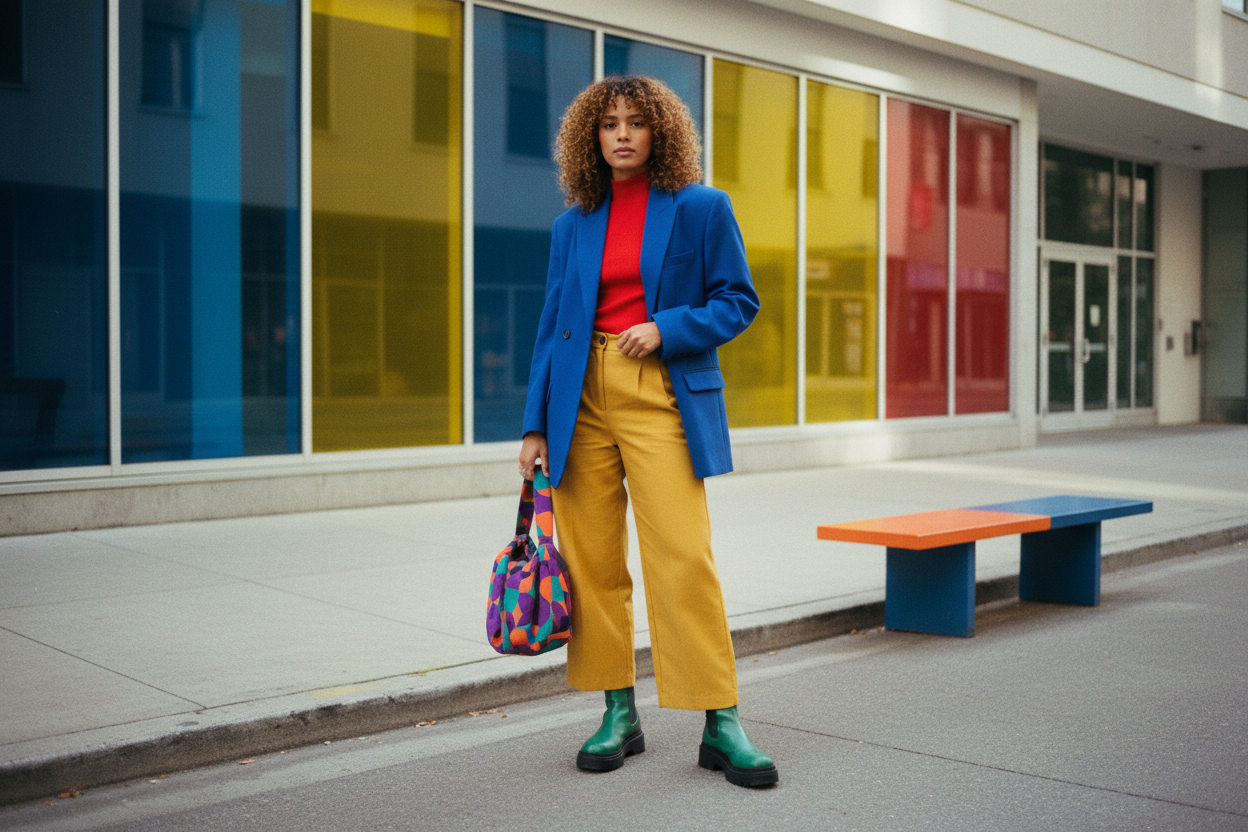
Harmonies That Always Work
Some combinations are reliable crowd pleasers. Complementary pairings like blue with orange, red with green, or purple with yellow deliver striking contrast; soften them by choosing muted versions or by inserting a neutral buffer. Analogous mixes blend neighboring hues such as teal, blue, and navy for a calm, layered effect that is ideal for tonal dressing. Monochrome looks use one hue in varied value and saturation for depth, like a range of forest, moss, and sage greens grounded with tan footwear. Triadic schemes combine three evenly spaced colors, but moderation is key: let one color lead and let the others play supporting roles through accessories or small garments. Work with scale too; a dominant color in a coat, a secondary in knitwear, and a subtle accent in a scarf or belt. Keep texture and pattern in mind so these harmonies feel dimensional rather than flat, ensuring your outfit reads curated, not costume.
Balancing Saturation and Value
Two quiet variables make or break cohesion: saturation and value. Saturation is how intense a color is, while value is how light or dark it reads. A bright, highly saturated jacket can overwhelm if paired with equally intense trousers; temper it with a toned or muted piece so the eye has a place to rest. Light values lift and widen, dark values slim and ground, so use tints and shades strategically to balance your silhouette. A deep green skirt with a soft sage knit bridges value and saturation, then a cream boot brightens the base. Consider finish as well: matte cottons quiet a vivid hue, while sheen from silk or polished leather amplifies it. If you are uncertain, align one element across the outfit, such as keeping all pieces in similar value but varied textures, or choosing one saturated accent against a palette of mid-value neutrals for crisp clarity.
Patterns, Prints, and Proportions
Color harmony extends to patterns. Start with a dominant background color that echoes your base neutral, then pick up one or two colors from the print as accents elsewhere. If your shirt features navy with small rust and ivory motifs, choose rust suede shoes and an ivory knit to tie everything together. Scale matters: mix large patterns with small ones for balance, and keep their color families aligned to avoid chaos. Use the 60-30-10 rule as a guide: sixty percent base color, thirty percent secondary, ten percent accent. This ratio helps patterns integrate smoothly with solids. Stripes, checks, and florals play well when they share undertones and value ranges. If a print is loud, calm it with textured neutrals like tweed or ribbed knits. Repeat a color subtly, perhaps through a belt edge, eyewear frame, or watch strap. That echo creates cohesion and makes even experimental combinations feel intentional and chic.
Practical Wardrobe Strategies
Translate theory into a system. Build a capsule around two core neutrals and two to three accent colors that flatter your undertone. Keep swatches or photos of your best combinations to reference when shopping. When you evaluate a garment, ask how it fits your palette in hue, saturation, and value; if it only works with one piece you own, reconsider. Plan outfits from the shoes up or jacket down so each look has a clear anchor. Test colors in different lighting, because indoor warmth and outdoor coolness can shift perception. Maintain colors by sorting laundry thoughtfully and using care products that preserve vibrancy. Edit regularly, removing items that clash with your palette to streamline decisions. Most importantly, let your preferences lead. Color harmony is about expression as much as rules. Treat these guidelines as scaffolding, then improvise confidently so your wardrobe feels cohesive, versatile, and unmistakably yours.